Talk To Crystals Redesign
Talk To Crystals Redesign
Talk To Crystals Redesign
Improving usability, visual hierarchy, and user trust across a growing e-commerce experience.
Improving usability, visual hierarchy, and user trust across a growing e-commerce experience.
Improving usability, visual hierarchy, and user trust across a growing e-commerce experience.
Role
Role
UI/UX Designer & Framer Developer
UI/UX Designer & Framer Developer
Tools
Tools
Figma
Figma
Duration
Duration
Sep-Oct 2024
Sep-Oct 2024
01. Overview
❝ The redesign focused on turning a visually cluttered shopping experience into a clearer, more trustworthy, and conversion-focused platform.❞
❝ The redesign focused on turning a visually cluttered shopping experience into a clearer, more trustworthy, and conversion-focused platform.❞
Talk To Crystals had a strong product offering and loyal customer base, but the user experience contained several friction points that impacted navigation, readability, and product discovery.
Through competitive analysis, interface audits, and visual redesign, I explored ways to improve usability while preserving the brand's existing identity.
The result is a cleaner and more structured shopping experience designed to help users discover products faster and shop with greater confidence.
02. PROBLEM
❝ Users had products to explore, but not enough clarity to explore them.❞
❝ Users had products to explore, but not enough clarity to explore them.❞
❝ Users had products to explore, but not enough clarity to explore them.❞
The original interface suffered from inconsistent visual hierarchy, crowded layouts, and competing focal points. Important information such as promotions, categories, and product details often competed for attention, making it difficult for users to navigate efficiently. The experience felt visually busy, reducing trust and increasing cognitive load throughout the shopping journey.
The original interface suffered from inconsistent visual hierarchy, crowded layouts, and competing focal points. Important information such as promotions, categories, and product details often competed for attention, making it difficult for users to navigate efficiently. The experience felt visually busy, reducing trust and increasing cognitive load throughout the shopping journey.
03. GOALS
01
Improve Visual Hierarchy
Improve Visual Hierarchy
Improve Visual Hierarchy
Create a clear structure that guides attention toward products, offers, and primary actions.
Create a clear structure that guides attention toward products, offers, and primary actions.
02
Enhance Product Discovery
Enhance Product Discovery
Enhance Product Discovery
Help users browse categories and find products more efficiently.
Help users browse categories and find products more efficiently.
03
Increase Trust & Credibility
Increase Trust & Credibility
Increase Trust & Credibility
Use spacing, typography, and consistency to create a more professional shopping experience.
Use spacing, typography, and consistency to create a more professional shopping experience.
04
Modernize The Experience
Modernize The Experience
Modernize The Experience
Refresh the interface while maintaining alignment with the existing brand identity.
Refresh the interface while maintaining alignment with the existing brand identity.
04. RESEARCH AND COMPETITIVE ANALYSIS
Competitor Review
Competitor Review
I analyzed several e-commerce experiences within adjacent categories to identify patterns in navigation, merchandising, promotions, and product presentation.
I analyzed several e-commerce experiences within adjacent categories to identify patterns in navigation, merchandising, promotions, and product presentation.
Key Insights
Key Insights
Users respond better to cleaner layouts with clear visual separation.
Product categories should be immediately accessible.
Promotional banners must support, not compete with, product discovery.
Consistency improves both trust and usability.
INTERPRETATION :
INTERPRETATION :
The research revealed that successful shopping experiences prioritize clarity over visual density and make key actions immediately visible.
The research revealed that successful shopping experiences prioritize clarity over visual density and make key actions immediately visible.
05. DESIGN AUDIT
01
01
Visual Clutter
Visual Clutter
Visual Clutter
The interface contained too many competing elements, making it difficult for users to focus on key content and navigate efficiently.
The interface contained too many competing elements, making it difficult for users to focus on key content and navigate efficiently.
02
02
Weak Information Hierarchy
Weak Information Hierarchy
Weak Information Hierarchy
Important content was difficult to scan due to inconsistent sizing and spacing.
Important content was difficult to scan due to inconsistent sizing and spacing.
03
03
Navigation Friction
Navigation Friction
Navigation Friction
Users lacked a clear path to discover products and browse categories.
Users lacked a clear path to discover products and browse categories.
04
04
Inconsistent Components
Inconsistent Components
Inconsistent Components
Buttons, cards, and promotional sections lacked visual consistency across screens.
Buttons, cards, and promotional sections lacked visual consistency across screens.
05. DESIGN DECISIONS
01
01
Simplified Homepage Structure
Simplified Homepage Structure
Simplified Homepage Structure
The homepage was reorganized into clearly defined sections with improved spacing and content grouping. This created a more scannable experience and helped users focus on products, promotions, and categories without feeling overwhelmed.
The homepage was reorganized into clearly defined sections with improved spacing and content grouping. This created a more scannable experience and helped users focus on products, promotions, and categories without feeling overwhelmed.
02
02
Improved Product Discovery
Improved Product Discovery
Product categories, collections, and featured items were given stronger visual prominence. Better organization and clearer navigation paths made it easier for users to browse and discover products that matched their interests.
Product categories, collections, and featured items were given stronger visual prominence. Better organization and clearer navigation paths made it easier for users to browse and discover products that matched their interests.
03
03
Refined Visual Hierarchy
Refined Visual Hierarchy
Refined Visual Hierarchy
Typography, spacing, contrast, and component sizing were redesigned to establish a clear information hierarchy. Important content now stands out naturally, helping users understand where to focus their attention first.
Typography, spacing, contrast, and component sizing were redesigned to establish a clear information hierarchy. Important content now stands out naturally, helping users understand where to focus their attention first.
04
04
Established a Consistent Design System
Established a Consistent Design System
Established a Consistent Design System
A cohesive design language was introduced across banners, buttons, product cards, navigation elements, and promotional sections. Consistency improves usability, strengthens brand perception, and creates a more trustworthy shopping experience.
A cohesive design language was introduced across banners, buttons, product cards, navigation elements, and promotional sections. Consistency improves usability, strengthens brand perception, and creates a more trustworthy shopping experience.
06. BEFORE AND AFTER
01. Hero Section Redesign
01. Hero Section Redesign
01. Hero Section Redesign

The original landing page provided access to key shopping features, but important actions such as category browsing, account access, and cart visibility lacked emphasis. This made navigation feel less intuitive and increased the effort required to discover products.
Key Improvements
Added a dedicated All Categories button for faster product discovery.
Made the Login / Signup action more visible and accessible.
Increased cart visibility to better support the shopping journey.
Improved header organization and navigation clarity.
Reduced friction by highlighting the platform's primary actions.
Outcome
The redesigned landing page creates a clearer and more user-friendly shopping experience. By improving navigation hierarchy and action visibility, users can browse products, access their accounts, and move through the purchasing journey with greater ease and confidence.
The original landing page provided access to key shopping features, but important actions such as category browsing, account access, and cart visibility lacked emphasis. This made navigation feel less intuitive and increased the effort required to discover products.
Key Improvements
Added a dedicated All Categories button for faster product discovery.
Made the Login / Signup action more visible and accessible.
Increased cart visibility to better support the shopping journey.
Improved header organization and navigation clarity.
Reduced friction by highlighting the platform's primary actions.
Outcome
The redesigned landing page creates a clearer and more user-friendly shopping experience. By improving navigation hierarchy and action visibility, users can browse products, access their accounts, and move through the purchasing journey with greater ease and confidence.
02. Product Showcase Redesign
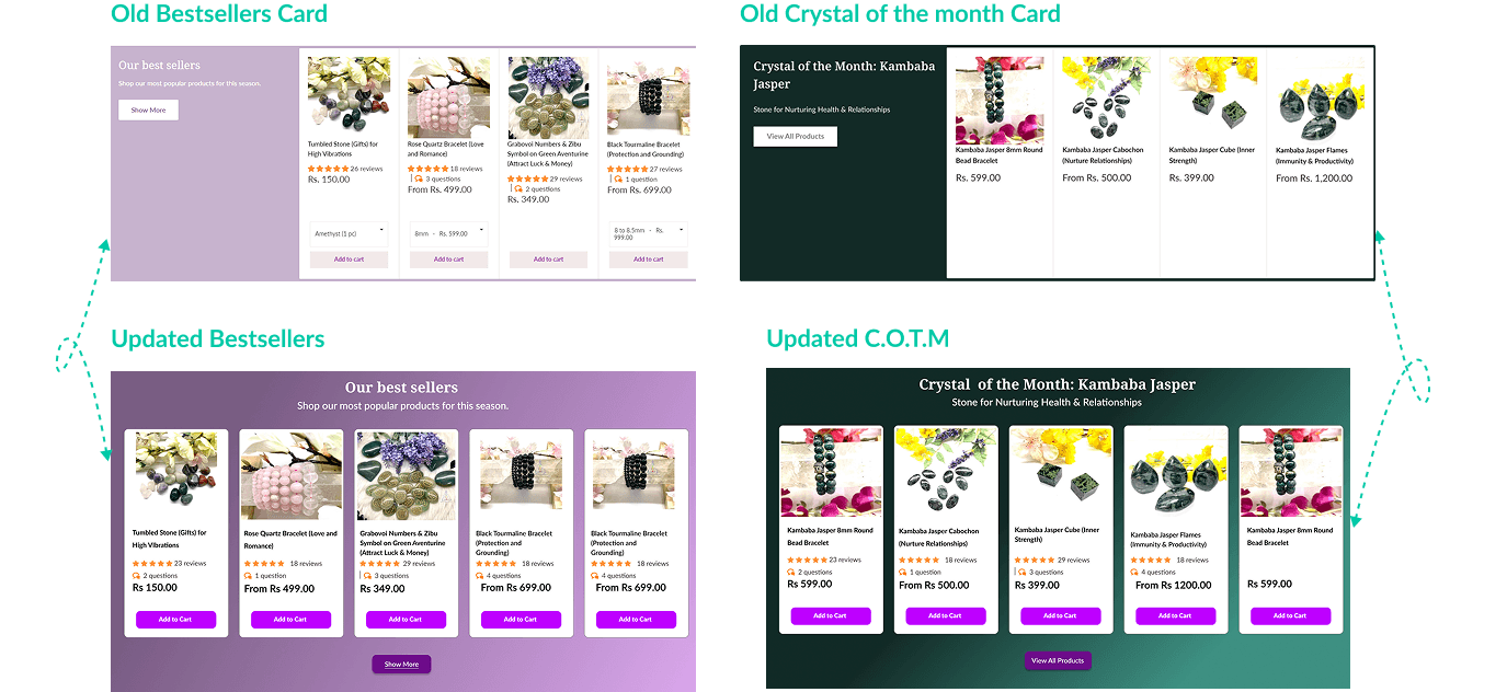
The original Bestsellers and Crystal of the Month sections placed significant emphasis on promotional content while reducing visibility of the products themselves. This created an imbalance where users had to work harder to browse and compare items.
Key Improvements
Shifted focus from promotional panels to the products themselves.
Increased the number of visible products within the viewport.
Created a more balanced layout with consistent card sizing and spacing.
Added stronger call-to-action buttons to encourage engagement.
Improved visual consistency across both showcase sections.
Outcome
The redesigned section shifts from interaction-heavy presentation to clarity-first communication. Visitors can now understand my complete design process within seconds, making the experience more intuitive while better showcasing how I approach problem-solving and product design.
The original Bestsellers and Crystal of the Month sections placed significant emphasis on promotional content while reducing visibility of the products themselves. This created an imbalance where users had to work harder to browse and compare items.
Key Improvements
Shifted focus from promotional panels to the products themselves.
Increased the number of visible products within the viewport.
Created a more balanced layout with consistent card sizing and spacing.
Added stronger call-to-action buttons to encourage engagement.
Improved visual consistency across both showcase sections.
Outcome
The redesigned section shifts from interaction-heavy presentation to clarity-first communication. Visitors can now understand my complete design process within seconds, making the experience more intuitive while better showcasing how I approach problem-solving and product design.
03. Reviews Section Redesign
03. Reviews Section Redesign
03. Reviews Section Redesign

The original reviews section displayed valuable customer feedback but lacked structure and visual consistency. Reviews appeared disconnected from one another, making the section difficult to scan and reducing the impact of social proof.
Key Improvements
Introduced dedicated review cards to organize customer feedback more clearly.
Created a consistent layout for ratings, review content, and customer information.
Improved readability through better spacing and content hierarchy.
Added clearer navigation controls for browsing testimonials.
Enhanced visual presentation to strengthen trust and credibility.
Outcome
The redesigned reviews section transforms customer feedback into a more engaging and trustworthy experience. By organizing testimonials into structured cards and improving navigation, users can quickly browse reviews and gain confidence in the products and brand.
The original reviews section displayed valuable customer feedback but lacked structure and visual consistency. Reviews appeared disconnected from one another, making the section difficult to scan and reducing the impact of social proof.
Key Improvements
Introduced dedicated review cards to organize customer feedback more clearly.
Created a consistent layout for ratings, review content, and customer information.
Improved readability through better spacing and content hierarchy.
Added clearer navigation controls for browsing testimonials.
Enhanced visual presentation to strengthen trust and credibility.
Outcome
The redesigned reviews section transforms customer feedback into a more engaging and trustworthy experience. By organizing testimonials into structured cards and improving navigation, users can quickly browse reviews and gain confidence in the products and brand.
04. Product Page Redesign

The original product page contained all the necessary purchase information, but navigation and primary actions lacked clarity. Important actions such as returning to previous pages, adding products to the cart, and purchasing immediately did not stand out enough, creating unnecessary friction during the buying process.
Key Improvements
Added a dedicated back navigation option to improve browsing efficiency.
Increased visibility of primary purchase actions through stronger CTA styling.
Established consistency between Add to Cart and Buy Now buttons.
Improved action hierarchy to guide users toward conversion-focused interactions.
Enhanced overall usability while maintaining the existing product information structure.
Outcome
The redesigned product page creates a smoother purchasing experience by improving navigation and emphasizing key actions. With clearer CTAs and better interaction hierarchy, users can browse products more confidently and complete purchase decisions with less friction.
The original product page contained all the necessary purchase information, but navigation and primary actions lacked clarity. Important actions such as returning to previous pages, adding products to the cart, and purchasing immediately did not stand out enough, creating unnecessary friction during the buying process.
Key Improvements
Added a dedicated back navigation option to improve browsing efficiency.
Increased visibility of primary purchase actions through stronger CTA styling.
Established consistency between Add to Cart and Buy Now buttons.
Improved action hierarchy to guide users toward conversion-focused interactions.
Enhanced overall usability while maintaining the existing product information structure.
Outcome
The redesigned product page creates a smoother purchasing experience by improving navigation and emphasizing key actions. With clearer CTAs and better interaction hierarchy, users can browse products more confidently and complete purchase decisions with less friction.
05. Login Experience Redesign
05. Login Experience Redesign
05. Login Experience Redesign
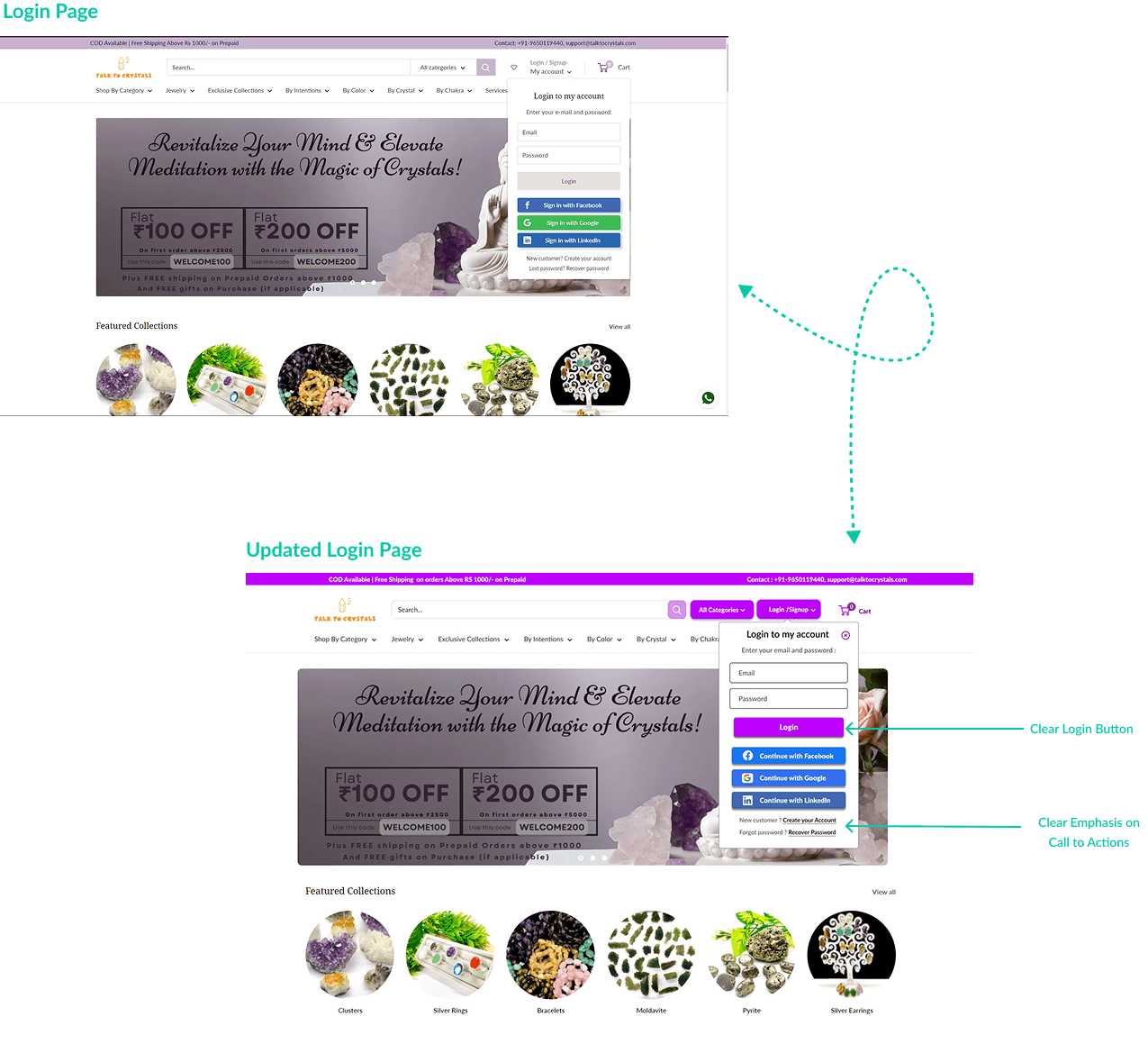
The original gallery showcased a single design at a time through a traditional carousel, limiting how much work visitors could see without interacting with the section. While it highlighted individual projects, it failed to communicate the breadth of my design experience and required unnecessary navigation to explore additional work. The redesign transforms the gallery into a dynamic showcase that emphasizes both visual variety and interaction.
Key Improvements
Increased prominence of the primary Login button.
Strengthened visual hierarchy within the login modal.
Improved emphasis on account creation and recovery actions.
Created clearer separation between primary and secondary actions.
Enhanced overall consistency with the updated design system.
Outcome
The redesigned login experience guides users more effectively through the authentication process. By improving action visibility and hierarchy, users can complete sign-in tasks faster while maintaining access to supporting account-related options.
The original gallery showcased a single design at a time through a traditional carousel, limiting how much work visitors could see without interacting with the section. While it highlighted individual projects, it failed to communicate the breadth of my design experience and required unnecessary navigation to explore additional work. The redesign transforms the gallery into a dynamic showcase that emphasizes both visual variety and interaction.
Key Improvements
Increased prominence of the primary Login button.
Strengthened visual hierarchy within the login modal.
Improved emphasis on account creation and recovery actions.
Created clearer separation between primary and secondary actions.
Enhanced overall consistency with the updated design system.
Outcome
The redesigned login experience guides users more effectively through the authentication process. By improving action visibility and hierarchy, users can complete sign-in tasks faster while maintaining access to supporting account-related options.
06. Product Card System Redesign

The original product cards lacked consistency in structure, spacing, and visual hierarchy. Differences in content length and component placement created an uneven browsing experience, making it harder for users to scan products and compare options efficiently.
Key Improvements
Established a consistent card structure across all product listings.
Improved spacing and alignment for better visual balance.
Created stronger hierarchy between product image, title, price, and actions.
Enhanced CTA visibility with more prominent Add to Cart buttons.
Improved product scannability and comparison across the grid.
Outcome
The redesigned card system creates a cleaner and more cohesive shopping experience. By standardizing layouts and emphasizing key actions, users can browse products more efficiently, compare options more easily, and move through the shopping journey with greater confidence.
The original product cards lacked consistency in structure, spacing, and visual hierarchy. Differences in content length and component placement created an uneven browsing experience, making it harder for users to scan products and compare options efficiently.
Key Improvements
Established a consistent card structure across all product listings.
Improved spacing and alignment for better visual balance.
Created stronger hierarchy between product image, title, price, and actions.
Enhanced CTA visibility with more prominent Add to Cart buttons.
Improved product scannability and comparison across the grid.
Outcome
The redesigned card system creates a cleaner and more cohesive shopping experience. By standardizing layouts and emphasizing key actions, users can browse products more efficiently, compare options more easily, and move through the shopping journey with greater confidence.
08. WHAT I LEARNED
01
01
Strong visual hierarchy can significantly improve usability without changing core functionality.
Strong visual hierarchy can significantly improve usability without changing core functionality.
02
02
Research and competitor analysis help validate design decisions rather than relying on assumptions.
Research and competitor analysis help validate design decisions rather than relying on assumptions.
03
03
Small improvements in spacing, typography, and structure can dramatically improve perceived quality.
Small improvements in spacing, typography, and structure can dramatically improve perceived quality.
09. NEXT STEPS
User Testing
User Testing
Validate design decisions with real shoppers.
Document process, decisions, and outcomes from various projects.
Mobile Optimization
Mobile Optimization
Explore additional improvements for smaller screens.
Explore additional improvements for smaller screens.
Checkout Experience
Checkout Experience
Redesign the purchasing flow to reduce abandonment and improve conversions.
Redesign the purchasing flow to reduce abandonment and improve conversions.
09. FINAL REFLECTION
Good redesigns are rarely about making interfaces look better. They are about making decisions easier, reducing friction, and helping users achieve their goals more efficiently.
Good redesigns are rarely about making interfaces look better. They are about making decisions easier, reducing friction, and helping users achieve their goals more efficiently.
Good redesigns are rarely about making interfaces look better. They are about making decisions easier, reducing friction, and helping users achieve their goals more efficiently.